We are excited to announce the launch of LogPoint version 6.2.0, characterized by new, cutting edge data visualization.
Besides refining the existing ways of visualising data, LogPoint 6.2.0 contains six additional innovative charts suitable for four different response types.
We at LogPoint know that having the data is not sufficient without powerful visualisations to make sense of it. That is why we are constantly creating and implementing new ways of visualising your data, to make it easy to interpret and respond to what your data is telling you.
We believe that working with the LogPoint solution should be efficient and intuitive, enabling you to gain the most insights from your data to later be used for increased incident identification, investigation and response.
Besides advanced visualizations, LogPoint 6.2.0 also has other important new features to offer. Starting from version 6.2.0, IPtoHost Enrichment
Source Plugins can be used to convert an IP address present in the log events into certain reliable hostname during the enrichment process. DNS caching is another important feature that has been implemented to reduce the load by decreasing the number of requests made by LogPoint to a
DNS server. This is applicable for cases when the record is already fetched.
The newly added charts are as follows:
- Tree map
- Radar Chart
- Sankey
- Geo map
- Parallel Coordinate
- Heatmap
Tree Map
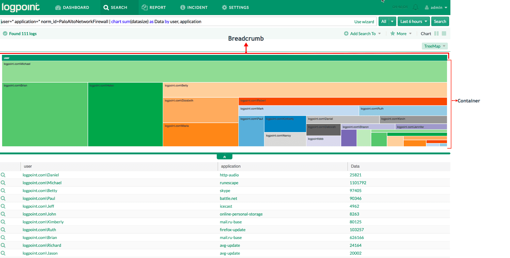
A tree map, used to represent hierarchical data as the branches in a tree, is essential when you have data with multiple groupings, as the hierarchical distribution can often not be visualized properly in other chart types or tables.Tree map solves this issue by helping you visualize and navigate all the branches in the data distribution. The visualization also enables you to drill down and reach to the final branch/leaf of the tree, as shown is the screenshots moving from source_address to referrer and then to the resource. The main Tree Map use-cases include, but are not limited to, comparisons, hierarchy, part-to-a-whole, and proportions.
Use Cases in LogPoint
Hierarchical distribution among various attributes for web application data usage
Radar Chart
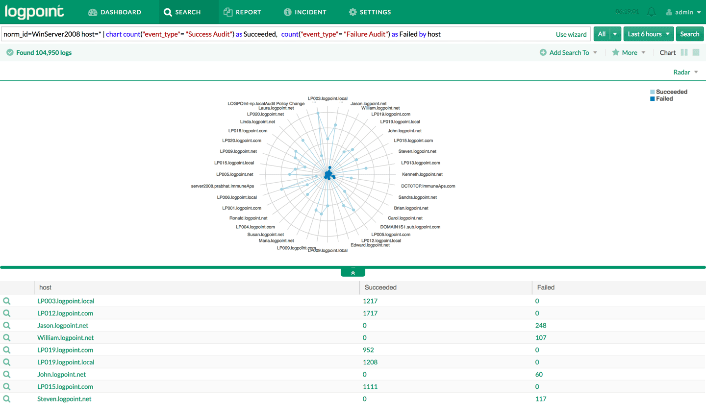
Radar charts are a great way to compare multiple quantitative variables and to represent which variables are scoring high or low within a dataset. The radar chart in LogPoint is best suited to visualize comparison graphs, patterns and relationships, which can be useful for spotting the outliers in the dataset – especially in cases of operation-related analysis, such as performance metrics and quality improvement.
Use Cases in LogPoint
Bandwidth usage by source
Sankey Diagram
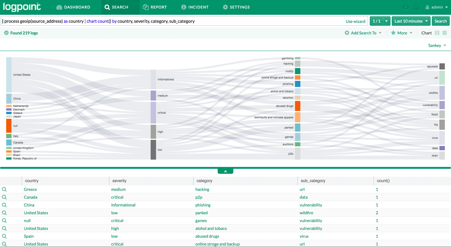
The Sankey Diagram represents the flow of a given quantity in relation to associated attributes. The width of the flow is directly proportional to the measured quantity. Sankey Diagram can be used for visualizing flow of data across boundaries and is applicable to regulatory reporting, such as GDPR. Some of the most common applications can be monitoring bandwidth, response time, CPU usage, memory usage and even the count of events against the attributes. LogPoint’s Sankey diagrams support single aggregation on more than one groupings.
Use Cases in LogPoint
GeoMap
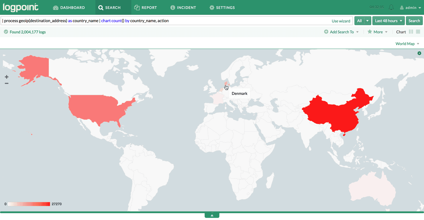
GeoMap is a great tool to plot geographical locations and can be used to show the distribution of outbound or inbound connections in case of compliance reporting, for example in connection to the GDPR. Statistics on geographical attributes can be presented as an aggregated summary on the maps.
Use Cases in LogPoint
Distribution by geo-location
Parallel Coordinate Chart
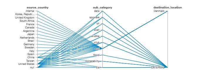
The parallel Coordinate chart in LogPoint is used to show multidimensional patterns from a given dataset, which is highly valuable when working with multivalued fields. These dimensions are plotted on the vertical axis, while the association between the values in the axis is shown in the connecting lines. The Parallel Coordinate chart is a great way to represent patterns, relationships and comparisons.
Use Cases in LogPoint
Suspicious connections
HeatMap
Heatmaps visualize data through variations in coloring, as the color-coded visualization makes the data easy to understand. When applied to a tabular format, they are useful to cross-examine multivariate data by placing variables in the rows and columns and coloring the cells within the table.
Use Cases in LogPoint
Top Sources by Action


